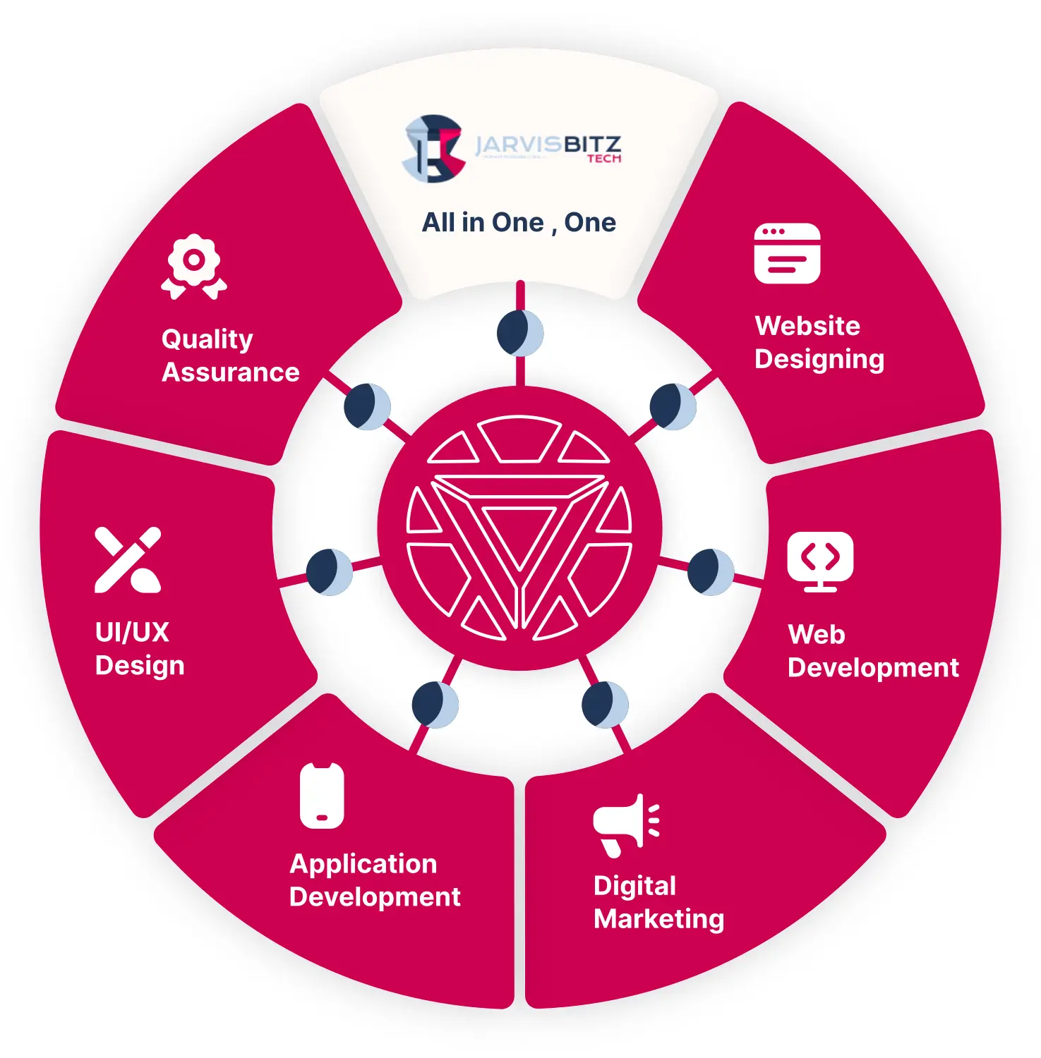
How our customized software solutions may help your organization grow.
Our outsourcing software development firm can provide a contemporary, dependable, and bug-free solution that will meet your business's demands and aid its growth.
A Trusted Name for
your Digital
Solutions
As a recognized digital solution provider, JarvisBitz is considered the most trusted brand across the country and globe.
- We have created a paradigm to enhance this mending eventuality by taking all aspects.
- Our courses are made with experts, pack a ton of value, and are binge-suitable.

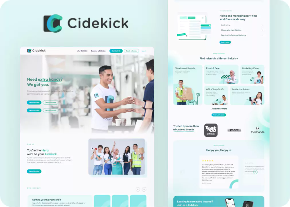
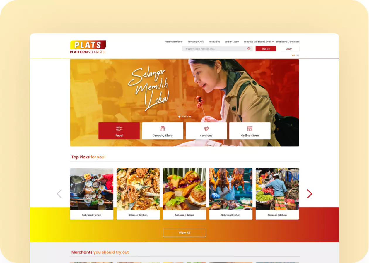
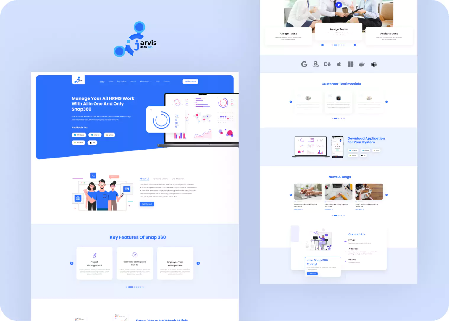
Our Work
Gallery
UI/UX Design

Web App
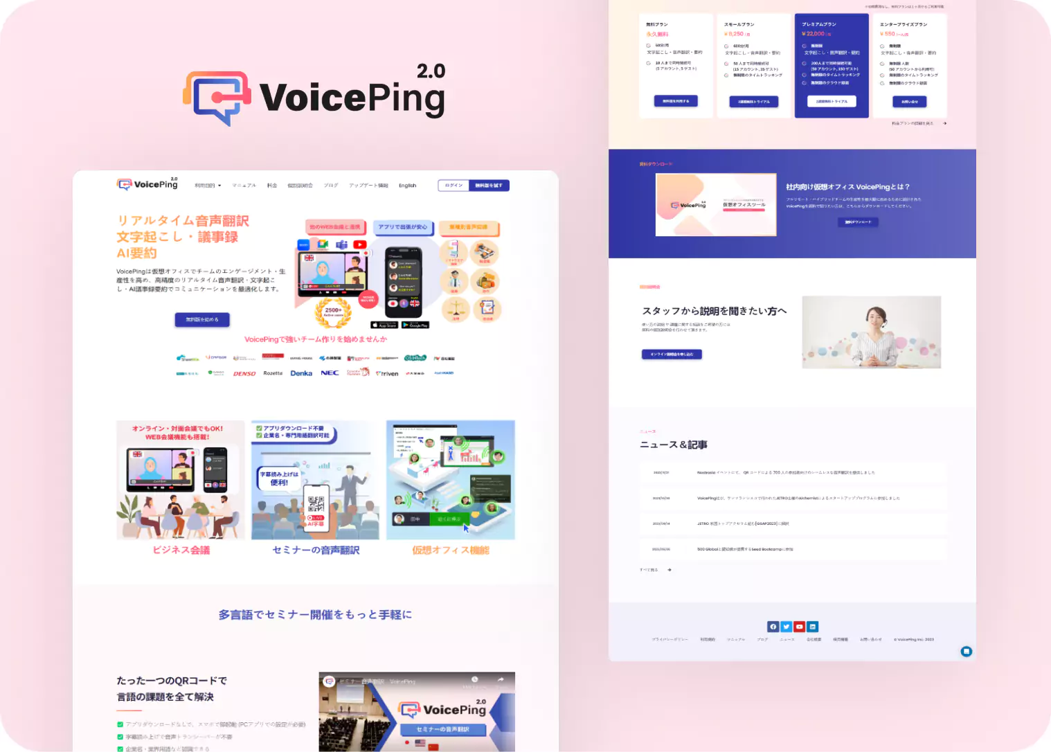

Branding
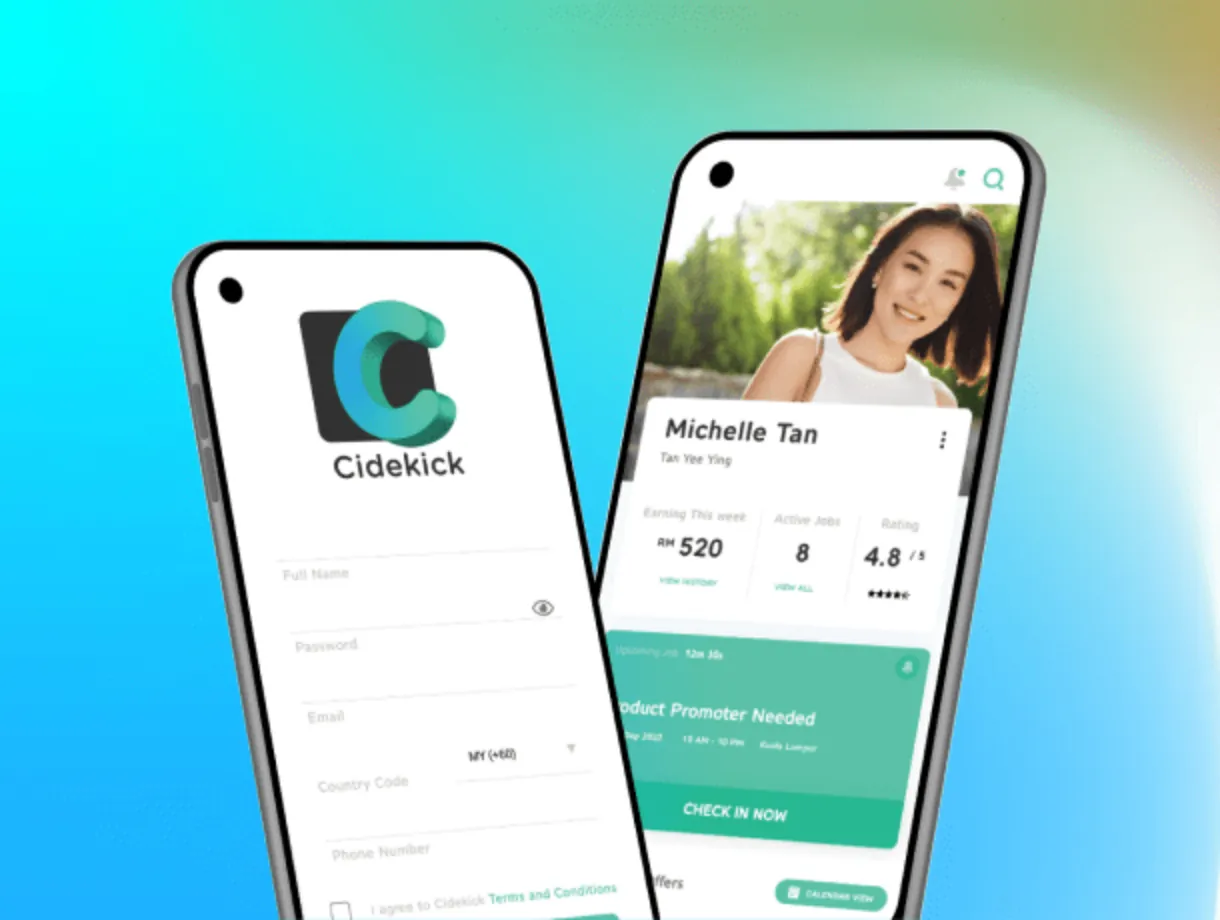
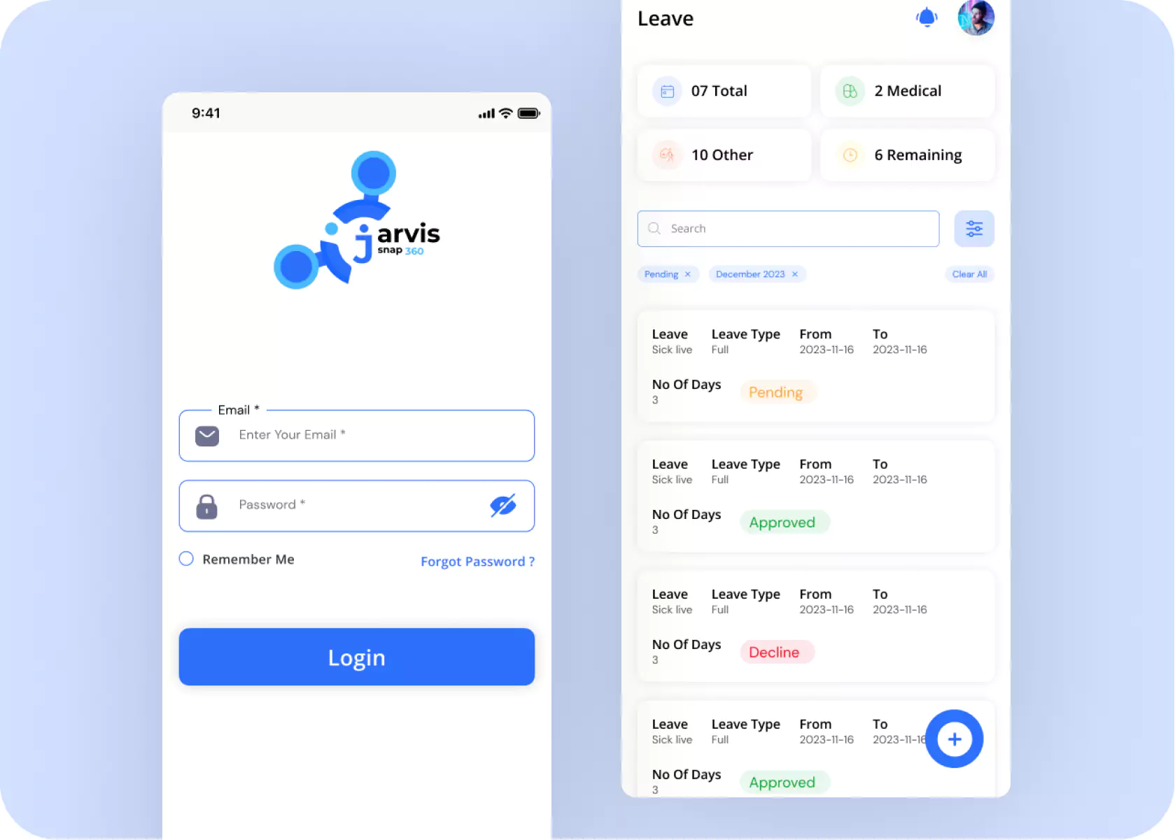
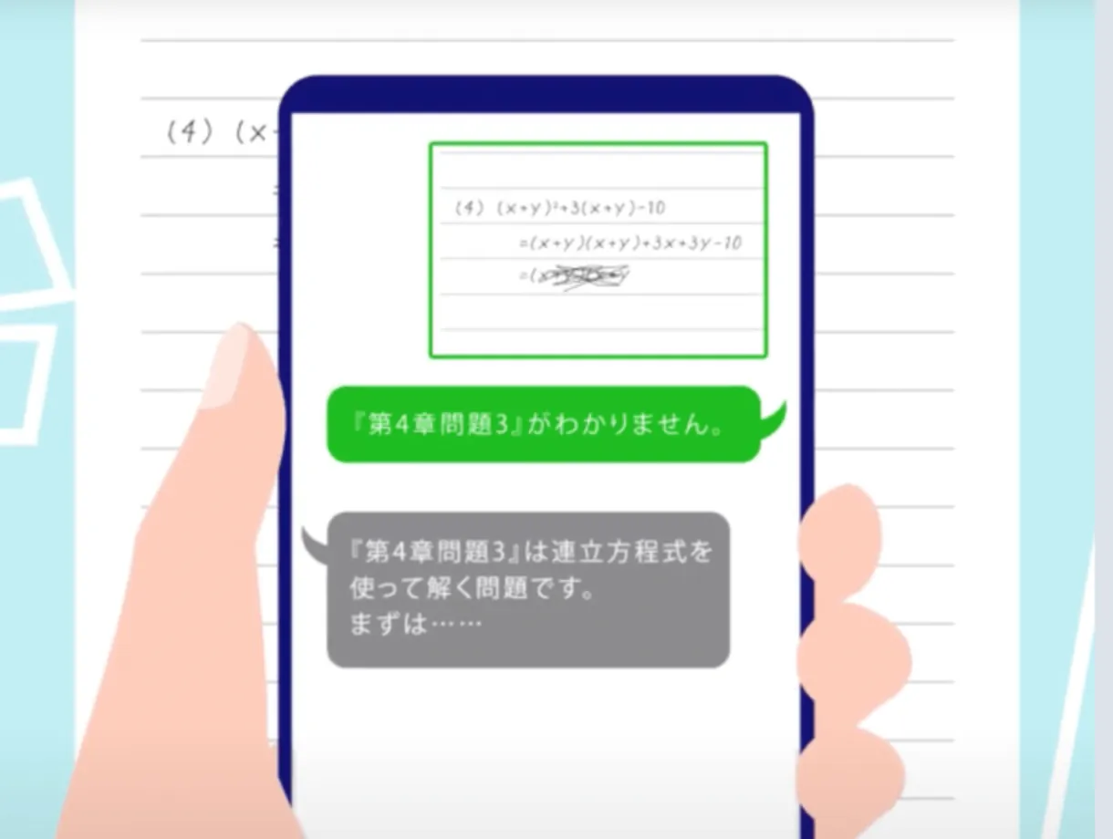
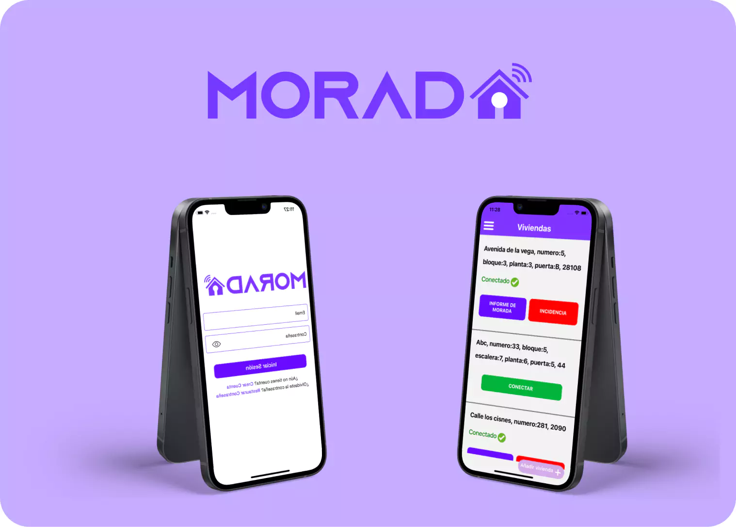
Mobile App
Desktop App
Hire Dedicated
Team
Unlock Innovation and Expertise – Hire a Dedicated Team Today and Elevate Your Projects to New Heights of Success!
Our Process
Release Plans
Following client agreement, we proceed to information gathering and documentation via our product backlog. Our forthcoming milestone release plan dictates phase one development requirements.
Design Sprint
Our unwavering commitment to user experience underscores our Agile approach, prioritizing UI/UX without compromise. Our innate best practices drive product development, consistently enhancing the user journey.
Development Sprint
Our product development team adheres to established coding standards and deadlines, conducts thorough code reviews, and internal demos to ensure a stable sprint release for comprehensive functionality testing.
Testing
Our proficient Testing team conducts comprehensive testing, utilizing both automation and manual methods, to validate all product requirements. The Quality Assurance team promptly communicates feedback to developers, upholding sprint deliverable quality.
Product Live
After thorough testing and verification, the product is deployed to the staging server, emulating a live environment. Comprehensive evaluation, including product demo and stakeholder review, precedes the official product launch.
Product Marketing
The product marketing team actively engages with end customers, employing strategic marketing initiatives to effectively position and make the product accessible to the target audience.